Twitter Branding for Non-Profit Organizations
Posted in:
Ultimately, non-profit organizations are still companies, and in as much need of branding and identity as any other company out there – in fact, more so: NPOs need brand loyalty to survive, as they exist on handouts and goodwill and donations. and the stronger the brand, the more the brand loyalty. With the emerging popularity of Twitter as a marketing medium, NPOs can no longer afford to ignore the ability to get their message across to this potential goldmine of loyal followers.
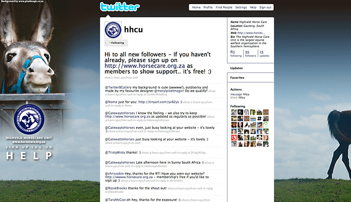
Most NPOs will have at least one professional designer amongst their ranks (we tend to be soft-hearted! ![]() ). I have been a horse owner and horse rider for years, and I’m a firm believer in giving back! Having donated the design and running of the HHCU (Highveld Horsecare Unit) website for 2 years, I was eager to introduce them to Twitter and design them a custom background. My HHCU clients and I brainstormed for a while and came up with the following basic principles:
). I have been a horse owner and horse rider for years, and I’m a firm believer in giving back! Having donated the design and running of the HHCU (Highveld Horsecare Unit) website for 2 years, I was eager to introduce them to Twitter and design them a custom background. My HHCU clients and I brainstormed for a while and came up with the following basic principles:
1. Yes, basic branding principles do still apply.
Include the NPO’s logo and corporate colours. In this case, dark navy blues were applied to the text and sidebar borders of the Twitter theme itself (Settings | Design | Change design colours) to match their website and letterhead colours. We started the background by making sure the navy blue logo was prominently displayed with the name of the NPO easily legible beneath it. We chose their logo as their avatar, because more than one staff member would be tweeting from that account.
2. Appeal to the heart – the “awww cuuuuuuute” factor
We picked the cutest donkey photo we could find from a photo shoot donated for an ad campaign for the HHCU earlier in the year. Along with the logo, this would serve to cement the brand as this same image (with a few variations) had been used in local print ad campaigns I’d done for them. And that donkey has the “aww cuuuuute!” factor in spades even for people who’ve never heard of the HHCU. we knew that the cuteness factor would be worth at least a second look! ![]()
Emotionally, we were looking for a background that projected a serene, happy feeling: a paradigm shift away from the images of horrific brutality and neglect that the HHCU have to deal with on a daily basis. HHCU wanted their profile to be a place of calm where Tweeters could tweet about all the good that could be done.
3. Get your message across…
.. quickly and clearly. A very short, simple strapline (“Sign up. Log on. Help. www.horsecare.org.za”) provided by a horse loving copywriter quickly got the message across that we were wanting to use Twitter to drive equine lovers to the website, where lengthier information could be disseminated. And it’s worked – website hits are up by about 20% consistently since we launched HHCU on Twitter!
4. Less IS more
We chose a very simple landscape as a background image with lots of open space, blue (to echo the Corporate ID colour) sky and a peaceful feel – with just the subtle suggestion of a horse leaving the screen to the right, so that people had a really good idea of what HHCU does from looking at the pictures, without it being “in your face” obvious. (We’ve had more comments about the horse walking out of frame than even the cuteness of the donkey generated!)
5. Link luv!
We’re proud of our work and proud to be associated with the HHCU and their twitter branding. So we placed a link back to my website discreetly at the top left of the screen – with our client’s permission, of course! If you aren’t proud enough of your work to ask to put your name on it, don’t put it out there!
And here’s the result ….
The Highveld Horse Care Unit is the largest equine welfare organisation in the Southern hemisphere – sign up at http://www.horsecare.org.za to show support and get updates … it’s free!
![]() Meryl Rosenberg is the owner of http://www.pixelmagic.co.za: designer, pixel alchemist, equine lover and part-time riding teacher.
Meryl Rosenberg is the owner of http://www.pixelmagic.co.za: designer, pixel alchemist, equine lover and part-time riding teacher.
A self-taught designer, she is passionate about Social Networking as a marketing tool and is strongly supportive of small businesses. Working on her own has given her a healthy resect for the power of online communication, and she has built a network of designers, photographers, copywriters and other related services to enhance her client’s finished product as well as having an effective feedback group that transcends geographical boundaries.


I am a big fan of this one! Well done Meryl!!
Meryl, wonderful twitter background — I too love the donkey photo, but also the nice way the whole design is setup. Also this is an article with important info that I wish more rescue groups would learn about. I did retweet your article and I hope others will too.