20 Steps To Create A Killer Twitter Background
Posted in:
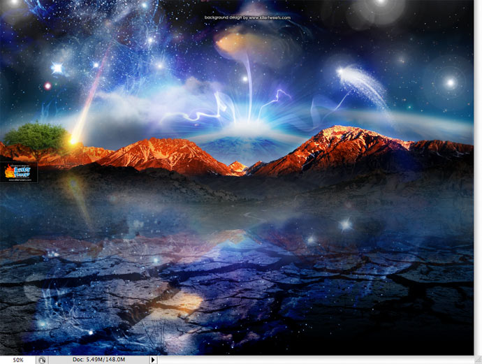
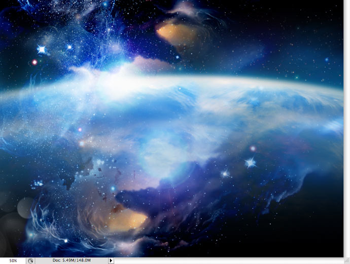
The background is entitled “The Beginning.” It’s a background that we offer for free on our KillerTweets website. It’s been downloaded over 5000 times as of writing this tutorial. Feel free to visit the site and download it for yourself.
There are many ways to work within the layers (i.e. blending modes, layer properties, etc.) to create your desired effects and including them all in one tutorial would make for a really long one. So, I tried to be as concise as possible with my explanations.
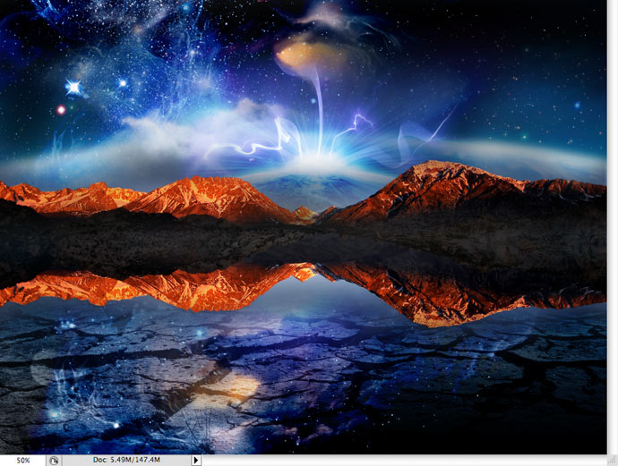
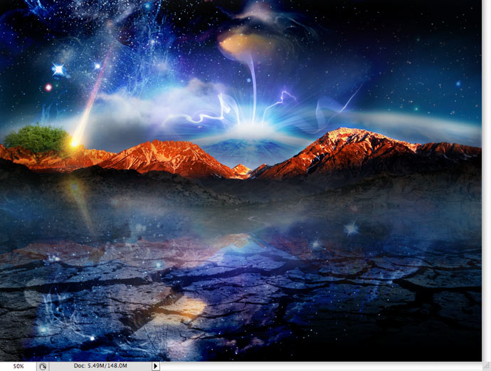
This was a pretty fun background to work on. I wanted to create this incredible cosmic scene incorporating a lot of elements related to earth and space. This is actually one of my favorite designs and I’m happy to share it with you. The first picture, of course, is the completed design.
The first step in any design like this is to start compiling images to make the collage. There are many sources to find stock photography and a Google search will also turn up some pretty incredible images. You can purchase stock photography from sources such as Corbis, Getty Images, iStockphoto, or Shutterstock. There are many place out there to find what you’re looking for. This design is a combination of both stock photography and some photography of my own.
Step 1
I started the design by creating a new document that was sized at 1600X1200 pixels, 72 DPI. In our designs, we’ve found that this size works the best for almost any resolution monitor. Not too big, not to small. There are really no right or wrong sizes as long as your design is well blended across your background. Also, keep in mind that most people are on widescreen monitors and the old 1024×768 standard is very quickly going away, if not already buried.
Step 2
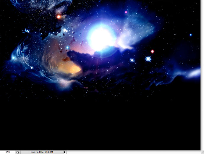
Next, I found a really cool image of a galaxy with bright colors and cool elements. I figured this would be a great image to start with as I built my layers to achieve the desired result.
Step 3
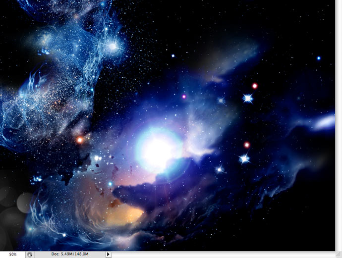
I duplicated that layer and moved it toward the bottom of the page, erasing the top of the image so that it blended better with the layer below.
Step 4
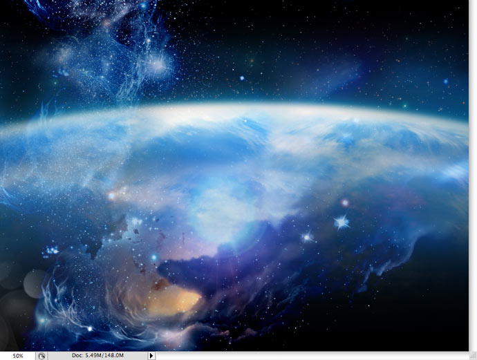
I found an image of the top crest of a globe. I sized it to fit my 1600 px wide canvas and centered it vertically. I added a layer mask and used the gradient tool to blend the image above the crest and below the crest. Again, that made for better continuity with the layers below.
Step 5
I duplicated my galaxy layer and moved it above the globe layer I just created and set the Blend Mode of that layer to “screen” in my layer properties. This gets rid of the black space in the image and only allows the lighter layers to show.
Step 6
I wanted to add some texture to the bottom by creating this crackle effect. I found an image of cracked earth, sized it to my canvas and put it at the bottom of the page. Again, I created a layer mask and used the gradient tool to blend the top of the image with the layers below.
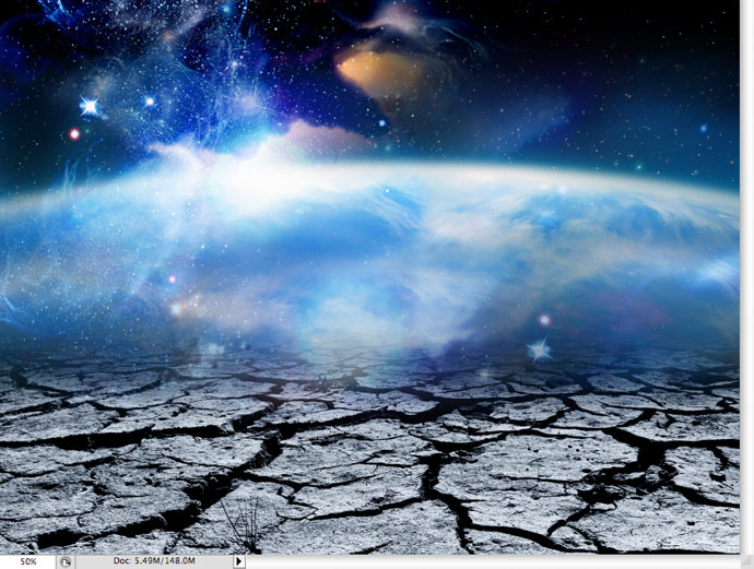
Step 7
This time, I set the Blend Mode of that layer to “soft light” in my layer properties.

Step 8
I added a great picture I found of some mountains. I used the eraser tool to erase everything above the mountain tops. I then added a layer mask and used the gradient tool to blend the bottom of the image with the layers below.
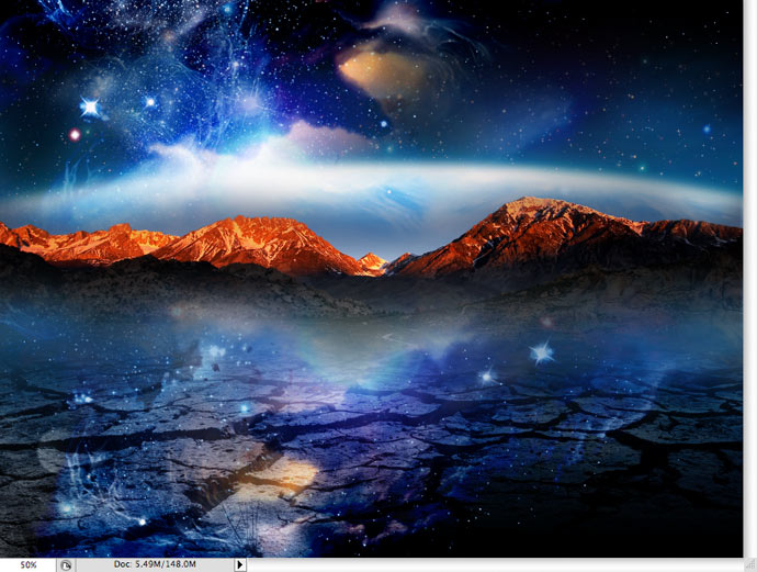
Step 9
I added an image of some clouds I found directly below the mountain layer to give some more depth to the design and create the appearance of a storm on the horizon. The image was in color, so I unsaturated it to create a gloomy mood. I erased out around the clouds what I didn’t want of the background.
Step 10
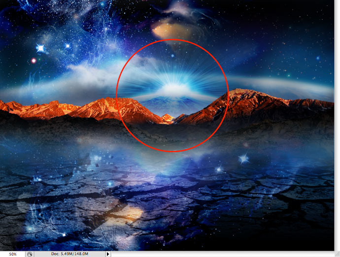
I had another image of a globe with light cresting over the top and put that layer directly behind the mountains. I created a layer mask and used the gradient tool to blend the top, left and right sides. I set that layer to “overlay” in the layer properties. I duplicated that layer, adjusted the opacity back to around 85%, and used the eraser tool to clean up unwanted areas of that image.
Step 11
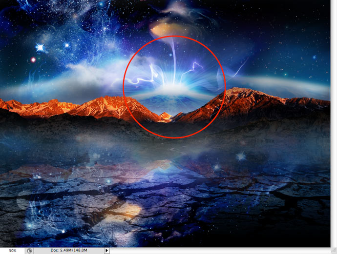
I found this really cool image of one of those electricity globes that electrify when you touch them. I situated that image over the globe layer I just created and set the layer blend to “screen.” I added a layer mask and used the gradient tool to blend that image with the background.
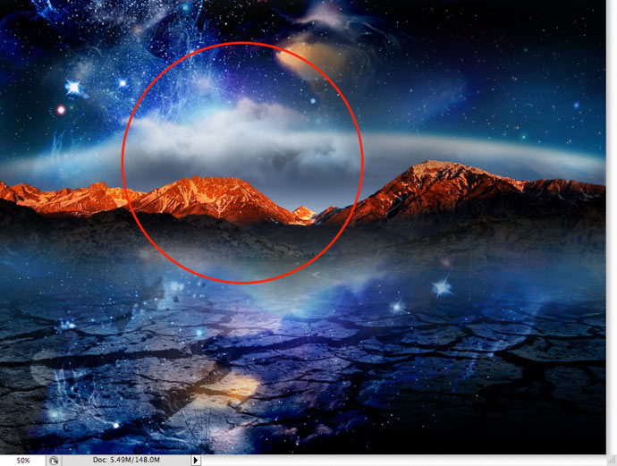
Step 12a
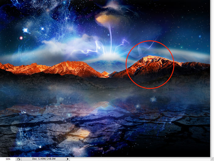
I wasn’t quite happy with the lighting on the mountain tops, so I created a blank layer above the mountain layer. I grabbed my paint brush, set the color to white, and painted a over the area that I wanted to highlight more.
Step 12b
I set that painted layer to “overlay” in my layer properties, adjusted the opacity to get the desired result, and used the eraser tool to clean up any unwanted overspray.
Step 13
Next, I duplicated the mountain layer. I clicked on “Edit/Transform/Flip Vertical” to flip the image vertically and create a mirror effect. I set the layer blend to “screen” in the layer properties and adjusted the opacity to achieve the desired result.
Step 14
I also had this image of a tree that I liked. This time, I set the layer blend to “multiply.” I then used the magic wand tool and eraser tool to take out the backgrounds around the tree.
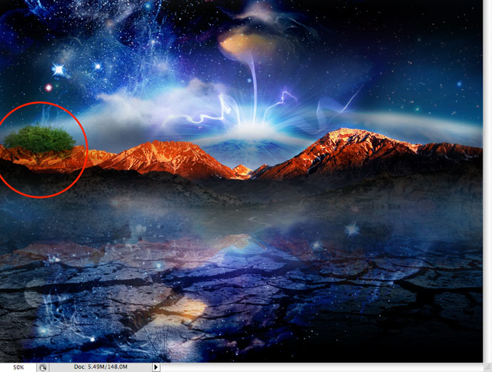
Step 15
The tree was a little too dark so I again created a new layer and painted white directly over the tree (see step #12A.). I set that layer to “overlay” in the layers property and adjusted the opacity to get the desired result.
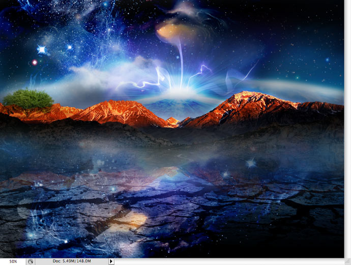
Step 16
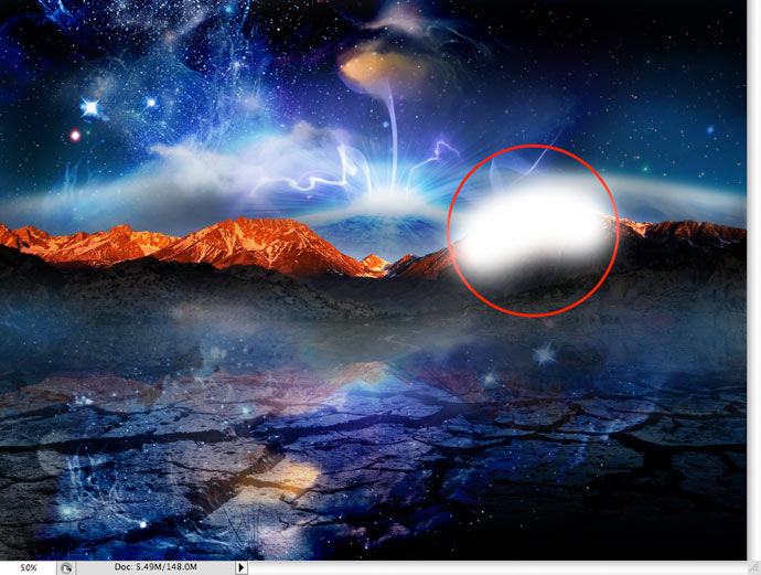
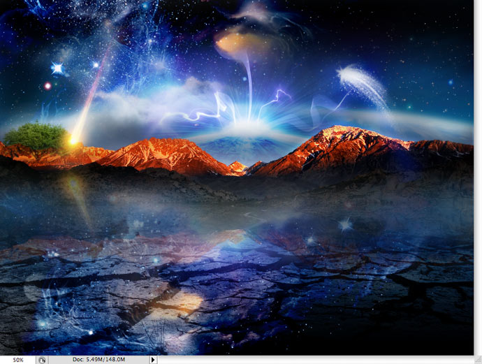
I had a couple of pictures of some CGI developed comets in multiple shapes & colors. I placed it in the image, set the layer blend to “screen” and used my eraser tool around the comet to take out the background.
Step 17
Next, I duplicated the mountain layer. I clicked on “Edit/Transform/Flip Vertical” to flip the image vertically and create a mirror effect. I set the layer blend to “screen” in the layer properties and adjusted the opacity to achieve the desired result.
Step 18
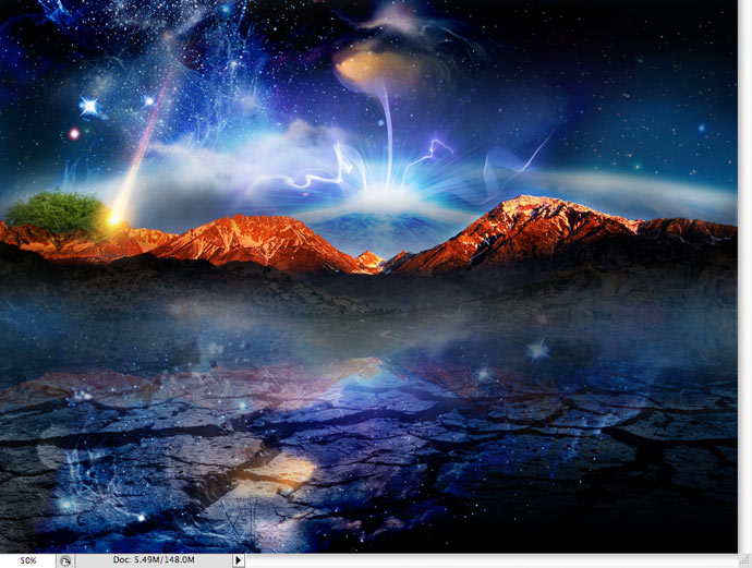
I added another comet on the right side above the mountains using the same technique in step #16.
Step 19
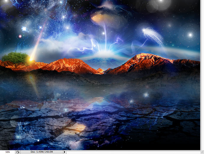
Then, using a lens flair brush (found via Google), I set my color to white and accentuated some of the stars in the sky and added a few of my own.
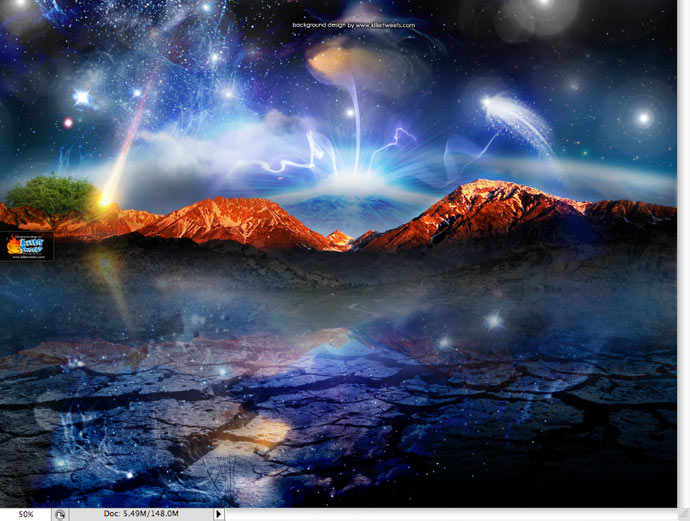
Step 20
The image is complete. From that point, we add our logo and upload to our website or Twitter page. That’s it.
Picking the right images is really important to any design. They can make or break it. You can also achieve a lot in Photoshop with the right layer blends and adjustment layers. Hopefully, this will inspire you to create your own killer backgrounds! Come check out our other stock backgrounds OR order a custom background design at www.KillerTweets.com.
![]() Chad McMillan (@badasstweets) is Creative Director for ShowCase Marketing, a marketing and brand architecture firm located on the east coast. He’s also the creator and principal designer for KillerTweets.com, a site specializing in killer Twitter background designs. He oversees a team of brand developers, programmers, and badass designers on a mission to change the face of graphic design.
Chad McMillan (@badasstweets) is Creative Director for ShowCase Marketing, a marketing and brand architecture firm located on the east coast. He’s also the creator and principal designer for KillerTweets.com, a site specializing in killer Twitter background designs. He oversees a team of brand developers, programmers, and badass designers on a mission to change the face of graphic design.


What people are saying:
1 Trackbacks For This Post
-
You are now listed on FAQPAL (May 20th, 2009 at 5:04 pm)
20 Steps To Create A Killer Twitter Background…
Learn how to make a killer Twitter background from one of the leading background designers….
Got something constructive to say?

Highest Rated BGs


Thanks for the write up!
This inspires me to get better at photoshop and finally create my own twitter background
That image could be a tad heavy, but it’s a really kick ass design. Nice work!
thx for the inspiration! great article!
i just found one fact you should think about:
you mention 1600×1200 as the perfect size for most users, but for the increasing widescreens @ 1680×1050 you’re getting too small and your visiors see this black stripe on the right.
Its always great to see how awesome works of art are made. You rule.. Love the way you made it so step by step and easy to follow. Great post. Thank you for sharing = )
Thanks for the kind words guys and gals!
Also, great point Roland. We’ve considered adjusting the size of the backgrounds to fit the 1680px width. We might even consider offering multiple sizes with each download. Appreciate it!
Also…a percentage of ALL sales in April go to support Water of life (http://givefreshwater.org), an organization dedicated to providing clean, fresh water to villages around the world by sending teams and equipment to dig wells in places like Liberia and Ecuador. It’s really a great cause.
Thanks again!
Cool effects you added..like the crackled ground
Hi. I don’t want to be trite, but the design is awesome. Thanks for sharing the whole process.
Thanks for sharing!